
Visualizations of Party Ideologies and Populism Across the Globe
Visualizing the world's political and economic sentiments through each country's top vote-getting parties

In 2019, a survey was sent to 1,891 political experts in various countries in order to quantify all party ideologies and rhetoric in 163 countries. This survey is called the Global Party Survey. The results of the survey are free to use online and formed into a comprehensive dataset. From this data, I selected three overarching variables: economic opinion (left to right), social opinion (liberal to conservative), and populist vs. pluralist rhetoric. I created three maps to visualize each country’s sentiments on these topics, and to see if any interesting trends emerge.
Map of Economic Opinion
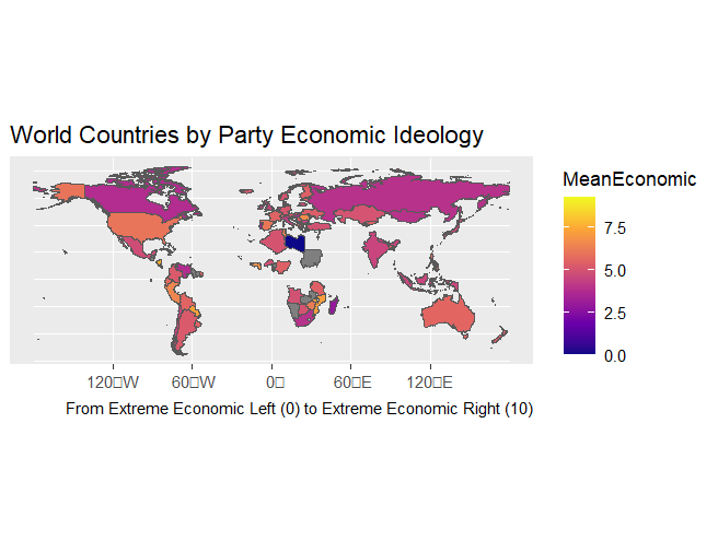
Each country’s mean economic sentiment, based on each party’s ideologies, is on a gradient scale of dark to light with dark being the economic left and light being the economic right. If a country is missing from the map, that means there is no data for it in any of the variables. If a country is gray, that means that there is no data for it in this specific variable.
Map of Social Opinion
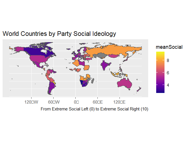
Each country’s mean social sentiment, based on each party’s ideologies, is on a gradient scale of dark to light with dark being the social left and light being the social right. If a country is missing from the map, that means there is no data for it in any of the variables. If a country is gray, that means that there is no data for it in this specific variable.
Map of Populist vs. Pluralist Rhetoric
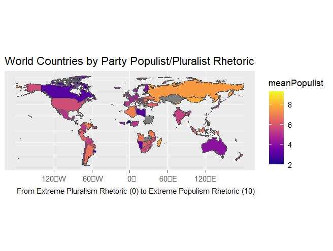
Each country’s mean populist vs pluralist rhetoric, based on each party’s ideologies, is on a gradient scale from left to right with dark being more pluralist rhetoric, and light being more populist rhetoric. If a country is missing from the map, that means there is no data for it in any of the variables. If a country is gray, that means that there is no data for it in this specific variable.
Methodology
The data comes from the Harvard Dataverse, and is free to download here. I used R to work with the data, utilizing the tidyverse, cowplot, googleway, ggrepel, ggspatial, sf, rnaturalearth, and rnaturalearthdata packages. The columns of data I worked with were Country, Partyname, Type_Values, Type_Partysize_vote, V4_Scale (Economic Left-Right), V6_Scale (Social Liberalism-Conservatism), and V8_Scale (Populist Rhetoric). In order to ensure that the data was not skewed by small parties that do not actually constitute much of the national opinion, I filtered out all of the parties considered “fringe" by the dataset. While this eliminates some percentage of a country’s political views it helps to more accurately represent the majority opinion without having to adjust the scale of the data by manually weighting it.
What were some of the other metrics and why did you end up with these three?
This was interesting! I liked seeing how countries varied with each metric and how just because they lean one way economically doesn’t mean they necessarily lean that way socially as well. Nice job with translating the data into clear-to-read maps!